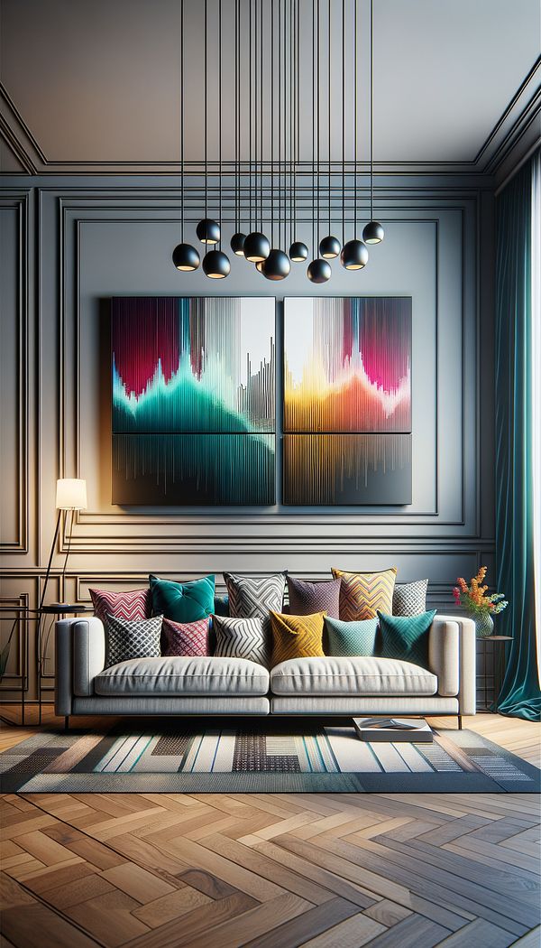
What is Rhythm?
Rhythm in interior design refers to the visual flow and repetition of elements to create a sense of organized movement.
Description
Rhythm in interior design is akin to the rhythm in music. It's all about creating a sequence or pattern that guides the eye from one point to another within a space, ensuring a harmonious flow that is pleasing and engaging. This can be achieved through the repetition of colors, shapes, textures, or lines, and is foundational in creating a space that feels cohesive and thoughtfully composed.
Rhythm can be implemented in several ways, including through repetition, progression, transition, and contrast. Repetition involves using the same element multiple times across a space for consistency. Progression sees elements changing gradually, such as a color gradient or increasing sizes of objects. Transition smooths the visual flow from one area to another, often using curves or lines that lead the eye in a specific direction. Contrast, meanwhile, uses distinctly different elements to create visual interest and highlight areas of a design.
Understanding and applying rhythm in interior design helps to create spaces that feel balanced and engaging, providing a visual pathway that encourages exploration without overwhelming the senses. By carefully considering how different elements work together, designers can craft environments that are not only functional but also aesthetically harmonious.
Usage
Rhythm is applied in various interior design projects, from residential to commercial spaces. An example might be using a consistent color palette throughout a home to create a cohesive feel or arranging furniture in a way that naturally leads the eye through a room. In a commercial setting, rhythm could be employed by repeating certain architectural features or materials to strengthen brand identity and visual appeal.
FAQs
-
How does rhythm affect a space?
Rhythm affects a space by creating a sense of harmony and continuity. It guides the viewer’s eye and ensures that the design feels cohesive and thoughtfully organized, enhancing both the aesthetic appeal and functionality of a room.
-
Can rhythm be used in all design styles?
Yes, rhythm can be applied across all design styles, serving as a universal principle that enhances spatial flow regardless of the specific aesthetic. Whether in minimalist, traditional, or eclectic interiors, rhythm plays a crucial role in achieving a balanced design.
-
Is it possible to have too much rhythm in a design?
Yes, overuse of rhythm, such as excessive repetition or overly uniform progression, can make a space feel monotonous or predictable. Striking the right balance is key, and sometimes incorporating elements of surprise or contrast can help break the monotony.
Practical Application
To effectively apply rhythm in your next design project, start by identifying elements that can be repeated or varied to create visual interest. Consider how color, texture, and form can guide the eye and contribute to a cohesive space. Aim for a balance that feels harmonious but not monotonous, and don’t be afraid to use contrast or transition to create focal points and add dynamism to the space.
-
Design Styles478 articles
-
Lighting111 articles
-
Decorative Techniques322 articles
-
Space Planning & Layout134 articles
-
Color & Patterns154 articles
-
CrochetingCrocheting is a versatile textile art form involving the interlocking of loops of yarn, thread, or other materials using a crochet hook.
-
Miter JointA miter joint is a type of joint made by beveling each of two parts to be joined, usually at a 45° angle, to form a corner, typically a 90° angle.
-
Linen-PressA linen-press is a type of cabinet traditionally used for storing linens, such as sheets, tablecloths, and towels.
-
Arts & CraftsArts & Crafts refers to both an interior design style and a movement prioritizing handcrafted, simple forms often inspired by nature.
-
Decorative ArtsDecorative arts is a term that encompasses a wide range of arts and crafts designed to embellish interior spaces and objects.
