What is Neutral Colors?
Neutral colors are Shades that don't show or are subdued in color, commonly serving as a versatile backdrop in design.
Description
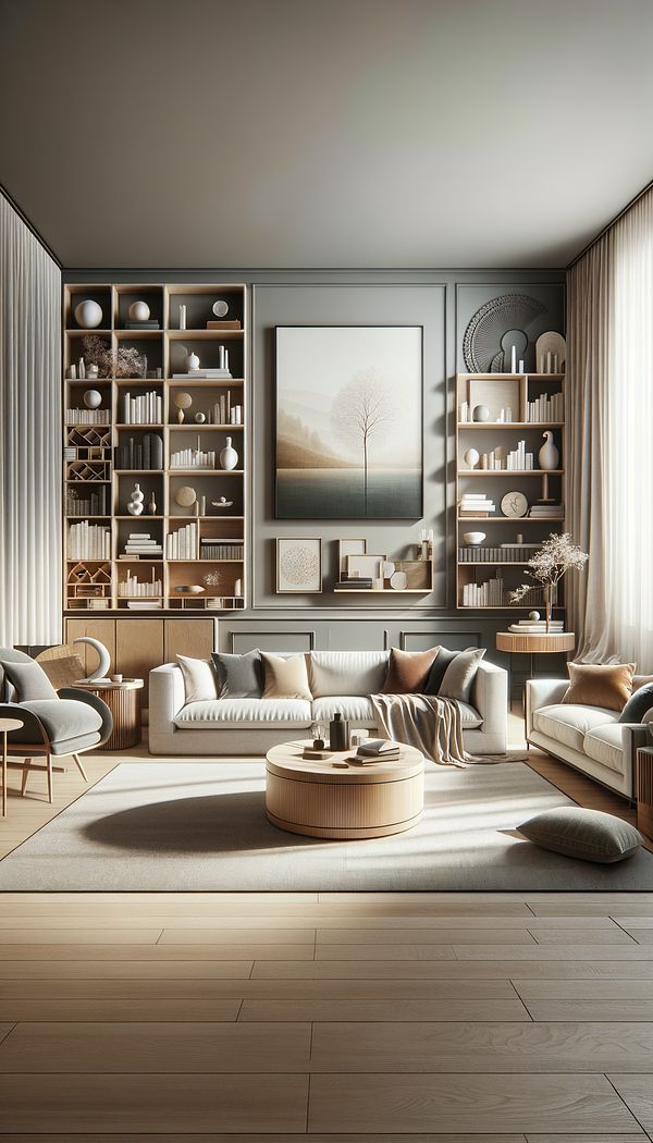
Neutral colors are the foundation upon which many interior design schemes are built. These Hues are often understated, a blend of colors that appear to be without color. They include shades of white, black, gray, and variations of browns and beiges, including Taupe and Greige. What makes neutral colors so invaluable in design is their capacity to complement virtually any color palette, providing a calming backdrop that allows other design elements to stand out.
Neutral colors are celebrated for their adaptability, able to fit seamlessly into nearly every style from minimalist to modern, from traditional to Scandinavian. Using neutral colors can make a space feel larger, brighter, and more open, as they reflect light more effectively than darker or more saturated colors. Additionally, neutral tones can help in creating an atmosphere that feels calm and serene, which is particularly desirable in spaces meant for relaxation like bedrooms and living rooms.
Incorporating neutral tones into your space can be as simple or as involved as you desire. They can dominate the space through walls, floors, and large furniture pieces, or they can accentuate through smaller decor items. The balance and blend of neutral tones offer endless possibilities for customization and change. As tastes and trends evolve, neutral colors remain timeless, making them a smart choice for those looking to create a versatile and enduring interior design.
Usage
In a living room setting, neutral colors might be used on the walls and floor to create a sense of space and openness, paired with a charcoal sofa and creamy white throws. In a bedroom, neutral tones could dominate the bedding and curtains, creating a restful sanctuary. In a modern kitchen, crisp white cabinets and a gray backsplash could serve as a clean backdrop for pops of color from accessories or foliage.
FAQs
-
Are neutrals only white, black, and gray?
No, neutral colors include a range of shades beyond just white, black, and gray. Browns, beiges, and some muted colors can also be considered neutral, depending on their context and how they're used in design.
-
Can neutral colors be warm or cool?
Yes, neutral colors can lean either warm or cool depending on the undertones present in them. For example, a beige with a pink undertone is warmer, while a gray with blue undertones would be cooler.
-
How do I add interest to a room with neutral colors?
Adding interest to a room with neutral tones can be achieved through texture, contrasting light and dark shades, and introducing patterns or unexpected elements like a boldly colored accessory or an interesting piece of art.
-
What colors are in a neutral color palette?
A neutral color palette often includes white, cream, beige, taupe, gray, black, brown, and greige. These shades work well together because they create a flexible backdrop that can support many styles, materials, and accent colors.
-
What are the best neutral colors for walls?
Soft warm neutrals like cream, beige, taupe, and greige are popular neutral wall colors because they add warmth while staying versatile. Cooler grays and off-whites can create a cleaner, more modern look, especially when paired with natural wood or textured textiles and upholstery.
Practical Application
When incorporating neutral colors into your design, consider the Undertone and the balance between warm and cool tones (Warm Colors and Cool Colors) to create a cohesive look. Use texture and material variety (like soft textiles and upholstery, smooth metals, and natural wood) to add depth and interest without relying on color alone. Additionally, using different shades of neutral colors can add complexity and sophistication to the space. Experiment with layering different neutrals to find the perfect combination for your style.
Try this in Room AI
Turn what you've learned into a real room design.
-
Accent ColorAn accent color is a color used sparingly to add vibrancy and interest to a room.
-
AccessoriesAccessories in interior design refer to items used to enhance the aesthetic appeal and functionality of a space.
-
AestheticAn aesthetic refers to the overall look or Design Style that is pleasing to the senses.
-
BalanceBalance in interior design refers to the distribution of Visual Weight in a space.
-
Built-inBuilt-in refers to any feature or piece of furniture that is permanently integrated into a room's structure as a Fixture.