What is Colour Harmony?
Colour Harmony is the pleasing arrangement of colours.
Description
Colour harmony is a foundational concept in interior design that involves the strategic use of colours to create aesthetically pleasing and cohesive spaces. It's based on the idea that certain combinations of colours can be more visually appealing and evoke specific emotions and feelings, enhancing the overall ambience of a room. Through the careful selection and coordination of colours, interior designers strive to achieve balance, unity, and an inviting atmosphere in their designs.
The principles of colour harmony are rooted in Color Theory, which explores how different colours interact with each other and the effects they have on perception and psychology. There are several common schemes used to create colour harmony, including monochromatic (using Shades, Tints, and Tones of a single colour), Analogous Colors (using colours that are next to each other on the Color Wheel), and Complementary Colors (using colours opposite each other on the colour wheel). These schemes serve as guidelines for mixing colours effectively.
Creating colour harmony requires a thoughtful approach, taking into consideration the room's size, lighting, and function, as well as the mood or atmosphere the designer wishes to convey. By applying these principles, designers can craft spaces that are visually cohesive and tailored to the needs and preferences of the inhabitants.
Usage
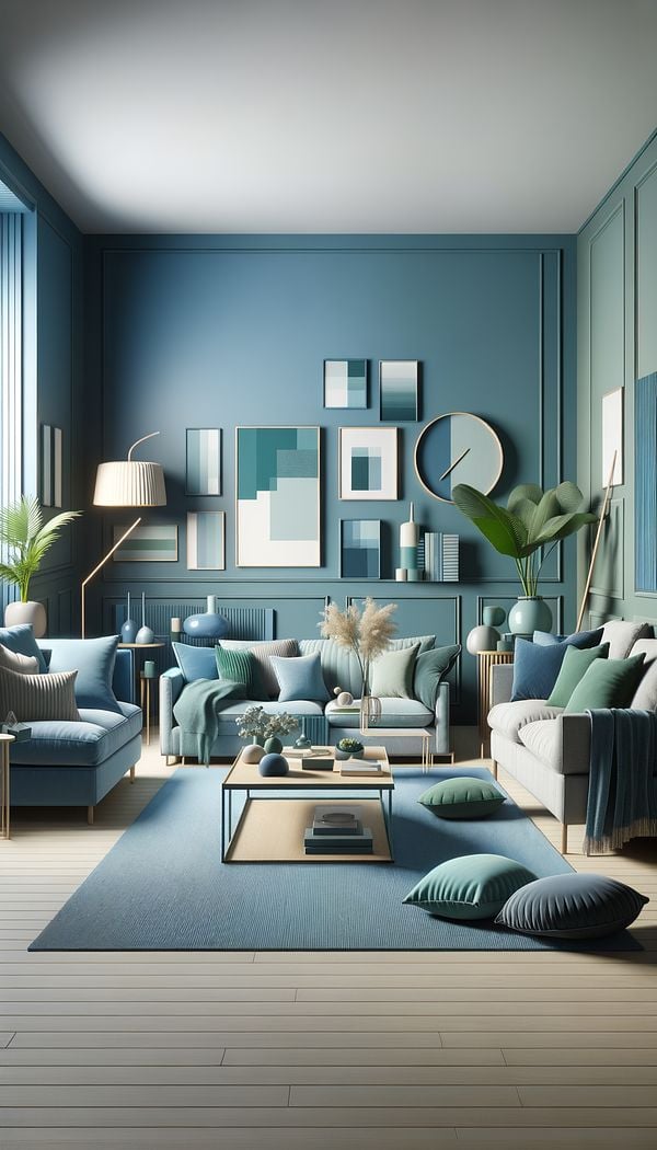
In a living room that invokes a sense of calm and relaxation, a designer might use an analogous colour scheme of blues and greens, drawing inspiration from nature to create harmony. Alternatively, for a more dynamic and stimulating space like a home office, a complementary colour scheme featuring blues and oranges could be employed to energize and inspire creativity.
FAQs
-
How does colour harmony affect the mood of a room?
Colour harmony can significantly influence the mood and atmosphere of a room. For example, a harmonious colour scheme using soft, warm tones can create a cozy and comforting environment, whereas a scheme with bold and contrasting colours might energize and stimulate the senses. The right colour combinations can evoke specific emotions, making the space feel more inviting and enjoyable.
-
Are there any rules for creating colour harmony?
While there are commonly used colour schemes like monochromatic, analogous, and complementary that promote harmony, interior design also allows for creativity and personal preference. Understanding the basics of colour theory and the emotional effects of different colours can guide you, but experimenting and adapting these principles to fit your style and the space’s needs is also encouraged.
-
Can colour harmony be applied to any style of interior design?
Yes, colour harmony is a versatile concept that can be applied across a variety of interior design styles, whether modern, traditional, minimalist, or eclectic. The key is to choose colour schemes that complement the style and the desired mood of the space, ensuring that the colours used enhance the overall aesthetic and atmosphere.
Practical Application
To achieve colour harmony in your design, start by choosing a colour scheme that resonates with you and the mood you wish to create. Consider the room's function, lighting, and existing elements. Use a colour wheel as a visual guide to select complementary, analogous, or monochromatic colours. Incorporate these colours through paints, furnishings, textiles, and decorative objects, maintaining a balance between bold colours and Neutral Colors to prevent overwhelming the space. Remember, the goal is to create a cohesive and visually appealing environment.
Try this in Room AI
Turn what you've learned into a real room design.
-
Accent ColorAn accent color is a color used sparingly to add vibrancy and interest to a room.
-
AccessoriesAccessories in interior design refer to items used to enhance the aesthetic appeal and functionality of a space.
-
AestheticAn aesthetic refers to the overall look or Design Style that is pleasing to the senses.
-
BalanceBalance in interior design refers to the distribution of Visual Weight in a space.
-
Built-inBuilt-in refers to any feature or piece of furniture that is permanently integrated into a room's structure as a Fixture.