What is Achromatic?
A design term referring to a color scheme that uses no Hue.
Description
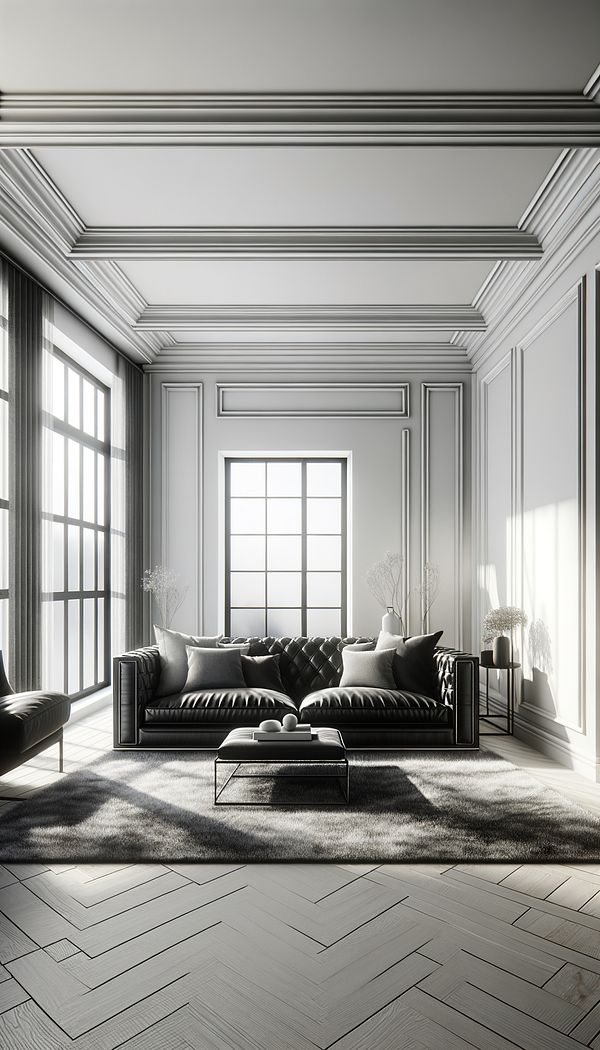
Achromatic is a term used in interior design to describe a color scheme that includes no hues, meaning it exclusively uses shades of black, white, and the various grays in between—all Neutral Colors. This absence of color makes achromatic schemes highly versatile, allowing for timeless and sophisticated interiors. Such spaces often focus on texture, Shape, and Form to add interest and depth, since color variation is minimal.
An achromatic color scheme is ideal for creating Contrast, either subtle or striking, depending on the range of Tones used. It can be employed across various design styles, from minimalist to modern, and can serve as an effective backdrop for highlighting architectural features or artwork. By relying on the visual weight of black, white, and gray, achromatic designs can evoke a wide range of atmospheres, from calm and serene to dramatic and bold.
Usage
Achromatic design is widely seen in modern and minimalist interiors, where the focus is on clean lines and simplicity. For example, a living room might feature a black-and-white photograph as a focal point, complemented by furniture in shades of gray. This approach to design is also commonly used in galleries and museums to keep the attention on the displayed works of art, rather than the space itself.
FAQs
-
How is an achromatic color scheme different from a monochromatic one?
Achromatic color schemes use shades of black, white, and gray without any hue, while monochromatic schemes are based on variations of a single hue, incorporating different shades, tints, and tones of that color.
-
Can achromatic interiors still have texture and depth?
Yes, achromatic interiors often leverage texture, shape, and form to add interest and depth, compensating for the lack of color variation.
-
Is it possible to use achromatic schemes in any room?
Absolutely. Achromatic color schemes are versatile and can be applied to any room, from kitchens to bedrooms, creating different atmospheres based on the tones and elements used.
Practical Application
When designing with an achromatic color scheme, focus on incorporating a variety of textures and materials to introduce depth and interest in the absence of color. For a balanced look, consider a mix of light and dark Shades and use them to enhance the architectural features or artwork in the space. Also, play with lighting to highlight shapes and forms, adding another layer of sophistication to the design.
Try this in Room AI
Turn what you've learned into a real room design.
-
Accent ColorAn accent color is a color used sparingly to add vibrancy and interest to a room.
-
AccessoriesAccessories in interior design refer to items used to enhance the aesthetic appeal and functionality of a space.
-
AestheticAn aesthetic refers to the overall look or Design Style that is pleasing to the senses.
-
BalanceBalance in interior design refers to the distribution of Visual Weight in a space.
-
Built-inBuilt-in refers to any feature or piece of furniture that is permanently integrated into a room's structure as a Fixture.