What is Complementary Colors?
Complementary colors are pairs of colors that, when combined, cancel each other out to produce a grayscale color like white or black.
Description
Complementary colors sit opposite each other on the color wheel, and they have a unique relationship in the realm of design. When placed next to each other, complementary colors create a stark contrast that can make each color appear brighter and more vibrant. This high contrast is not only visually stimulating but also can be used strategically in interior design to enhance visual interest and create dynamic spaces.
The principle of complementary colors is rooted in color theory, which explores how different colors interact and the emotional and psychological effects they can have on people. In interior design, understanding and leveraging complementary colors can help create a balanced and aesthetically pleasing environment. When used effectively, complementary colors can highlight architectural features, define spaces, and influence mood and atmosphere.
However, it's also important to use complementary colors judiciously. Overuse or improper pairing can lead to visual tension and discomfort, making a space feel overwhelming rather than inviting. The key is to find the right balance and to use complementary colors in a way that supports the overall design intent of the space.
Usage
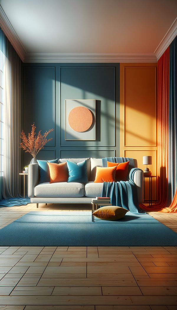
In a living room, using blue and orange as complementary colors can create a lively and inviting space. For example, a deep blue sofa contrasted with orange throw pillows can bring warmth and vibrancy to the room. Similarly, in a modern kitchen, pairing lime green bar stools with accents of vibrant purple can add a pop of color and energy to the space. In a more subdued example, a soft lavender wall paired with pale yellow accents can create a gentle, comforting atmosphere in a bedroom.
FAQs
-
How do I find complementary colors?
Complementary colors are found directly opposite each other on the color wheel. To find a color's complement, simply look across the wheel. For example, the complement of red is green, and the complement of blue is orange.
-
Can complementary colors be used in minimalist designs?
Yes, complementary colors can be effectively used in minimalist designs to add interest without clutter. A neutral backdrop with strategically placed complementary color accents can enhance the minimalist aesthetic while adding depth and vibrancy.
-
Are complementary colors suitable for all types of rooms?
Complementary colors can be used in any room, but the intensity and how they're applied should be carefully considered based on the room's function and desired atmosphere. Softer, pastel complementary pairs might be better suited for bedrooms, while more vibrant pairs can energize living spaces.
Practical Application
When incorporating complementary colors into your interior design, start with small accents or a single focal point to assess the impact. Consider the room's purpose and lighting when choosing hues. Balancing vivid complementary colors with neutral tones can prevent the space from feeling overwhelming. Remember, the key to using complementary colors effectively is moderation and thoughtful placement.
-
Color & Patterns154 articles
-
Space Planning & Layout134 articles
-
Decorating Principles & Elements330 articles
-
Builder, HomeIn the context of interior design, home builder refers to a person or company specializing in constructing residential homes.
-
ConsultationA meeting or series of meetings between a client and a professional to discuss plans, preferences, and requirements for an interior design project.
-
Contrasting WeltContrasting welt is a decorative edge detail used in upholstery and soft furnishings.
-
Built-inBuilt-in refers to any feature or piece of furniture that is permanently integrated into a room's structure.
-
RécamierA Récamier is a type of chaise longue featuring a high, curved headrest and a lower footrest without a backrest.