What is Receding Colors?
Receding colors are hues that appear to fall back or retreat in a space, creating an illusion of depth and expanse.
Description
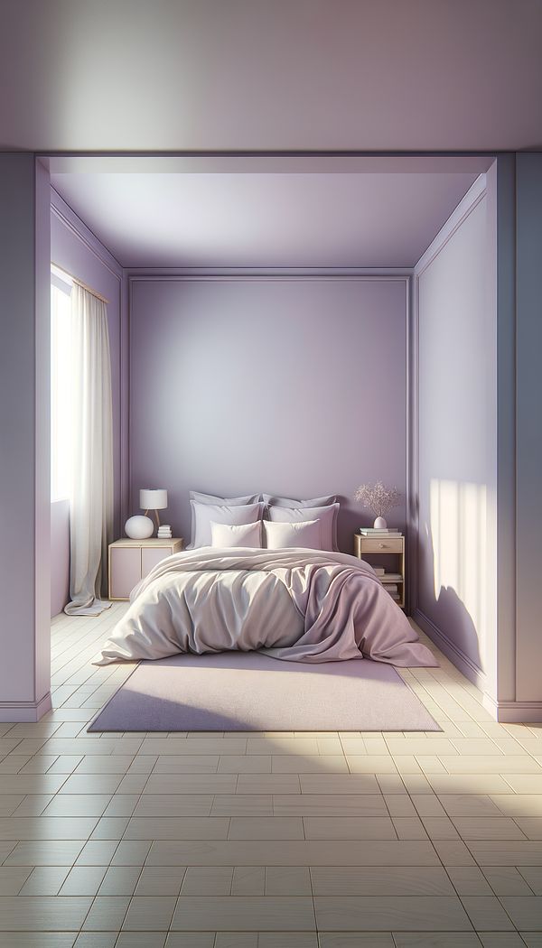
Receding colors are a fascinating concept within Color Theory and the realm of interior design, playing a pivotal role in shaping the visual dynamics of a space. These colors have the unique ability to make walls seem further away, thus creating a sense of spaciousness within a room. Characteristically, receding colors are found on the cooler side (Cool Colors) of the color wheel, including shades of blue, green, and purple. They are often employed in design strategies to make a small room feel larger or to create a serene, open atmosphere.
The psychological impact of receding colors stems from their calming qualities, which can make a space not only appear larger but also feel more tranquil and inviting. When utilized effectively, they can transform a cramped, oppressive room into a seemingly more expansive and relaxing environment. Incorporating these colors through paint, textiles and upholstery, or decorative objects can subtly shift the perceived spatial boundaries of a room without the need for structural changes.
Understanding how receding colors interact with lighting, furniture placement, and other decorative techniques is key to mastering their usage in design projects. For instance, pairing receding colors with ample natural light and Reflective Surfaces can enhance the illusion of depth. Furthermore, the strategic combination of receding and advancing colors can create dynamic and visually engaging interiors, highlighting specific architectural features or defining different zones within an open-plan space.
Usage
In a compact living room that feels a bit cramped, a designer might choose a soft, sky blue paint for the walls to make the space feel more open and airy. Similarly, in a small bedroom, using lavender bedding and curtains can give the illusion of more space, making the room feel larger and more inviting.
FAQs
-
How do receding colors affect the perception of space?
Receding colors can make walls appear farther away, thereby creating the illusion of a larger room. This effect is particularly useful in small spaces where physical expansion isn't possible.
-
What are some common receding colors?
Common receding colors include shades of blue, green, and purple. These colors are cool and calming, making them ideal for creating a sense of openness and spaciousness.
-
Can receding colors be used in any room?
Yes, receding colors can be effectively used in any room of the house to create the appearance of more space. They are particularly useful in smaller, more confined spaces.
-
How do receding colors work with lighting?
Receding colors work well with natural and artificial lighting to enhance the spaciousness of a room. Bright, well-lit spaces tend to amplify the depth-creating effect of receding colors.
-
Do receding colors have a psychological impact?
Yes, receding colors are known for their calming and tranquil qualities, which can make a space feel more peaceful and inviting.
-
Can receding and advancing colors be used together?
Absolutely. Using a combination of receding and advancing colors can create a dynamic and visually engaging space, highlighting architectural features or defining areas within a room.
Practical Application
To make the most out of receding colors in your next design project, consider the overall color palette and how these hues will interact with the lighting and existing features of the space. Start with a base of receding colors for walls or large surfaces and layer in contrasting textures and Accent Colors to add depth and interest. Remember, the goal is to create an inviting atmosphere that feels more expansive and open, so careful consideration of color combinations and Space Planning is essential.
Try this in Room AI
Turn what you've learned into a real room design.
-
Accent ColorAn accent color is a color used sparingly to add vibrancy and interest to a room.
-
AccessoriesAccessories in interior design refer to items used to enhance the aesthetic appeal and functionality of a space.
-
AestheticAn aesthetic refers to the overall look or style that is pleasing to the senses.
-
Ambient LightingAmbient lighting is the base layer of light in a space that provides overall illumination.
-
BalanceBalance in interior design refers to the distribution of visual weight in a space.