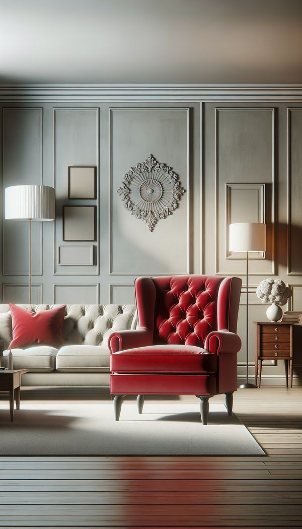
What is an Accent Piece?
An accent piece is an item within an interior space that stands out due to its color, shape, texture, or unique design.
Description
An accent piece in interior design is a key element that brings interest, contrast, and personality to a space. It's that special touch that can transform an otherwise average room into something remarkable and memorable. Accent pieces are designed to catch the eye and serve as focal points, encouraging conversation and admiration. They can vary wildly, from a vividly colored armchair in a monochrome room to an unusually shaped vase on a minimalist shelf. The power of an accent piece lies in its ability to complement the overall design theme while still standing out as unique. Selecting the right accent piece requires a keen eye for design and an understanding of how different elements can coalesce to create a harmonious yet intriguing space.
Incorporating an accent piece effectively involves considering the scale, color, and placement in relation to other items and the room's layout. The right accent piece not only harmonizes with the surroundings but also elevates them, adding depth and layers to the interior design.
Usage
Common examples of accent pieces include a brightly colored rug in an otherwise neutral room, a piece of bold artwork on a bare wall, or an ornate light fixture above a dining table. These items draw attention and break the monotony, injecting personality and flair into the space.
FAQs
-
How do I choose the right accent piece for my room?
Consider the room's existing color scheme, style, and any themes you’re following. Look for pieces that contrast interestingly with the current design but still harmonize with the overall aesthetic. Size, shape, and functionality should also be considered.
-
Can I have more than one accent piece in a room?
Yes, but balance is key. Multiple accent pieces should complement rather than compete with each other. They should also fit the room's scale, ensuring the space doesn’t feel cluttered or overwhelming.
-
Is it necessary to have an accent piece in every room?
While not strictly necessary, an accent piece can significantly enhance a room's appeal by adding depth, contrast, and personality. It’s a simple way to elevate the design without a complete overhaul.
Practical Application
When introducing an accent piece, start with one item to avoid overwhelming the space. Consider the visual weight and placement to ensure it draws the eye without detracting from the room's harmony. Remember, the aim is to complement and enhance the space, not overpower it.
-
Furniture Types599 articles
-
Lighting111 articles
-
Decorative Objects240 articles
-
Decorating Principles & Elements330 articles
-
Color & Patterns154 articles
-
RécamierA Récamier is a type of chaise longue featuring a high, curved headrest and a lower footrest without a backrest.
-
Vis-A-VisVis-à-vis in interior design refers to furniture or objects facing each other.
-
ChambrayChambray is a lightweight cotton fabric with a plain weave and a slightly glossy surface.
-
ProportionProportion in interior design refers to the ratio between elements in a space.
-
Sleepy Hollow ChairA Sleepy Hollow chair is a distinct type of armchair known for its comfort and unique design.
