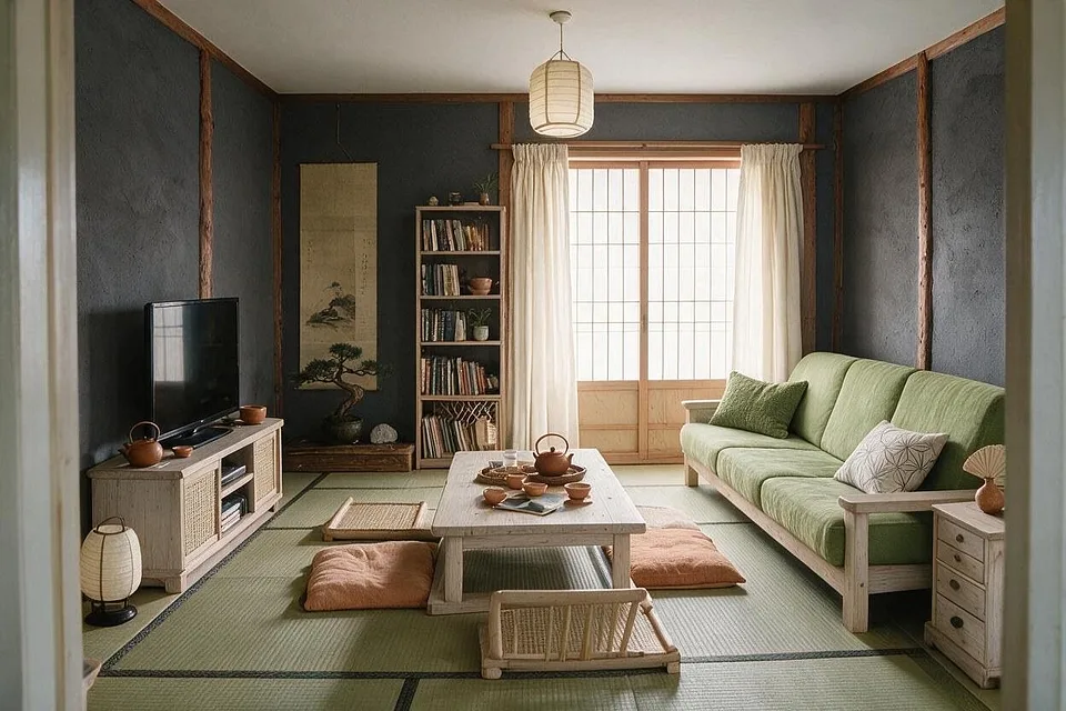
3 palettes, one room
Japanese color palettes
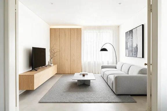
Japanese color is quiet and natural: wood, cream and paper white, with soft green from moss and tea, and black for line. Nothing shouts; the light through paper is part of the palette.
Every color, and where it goes
Hex codes to match against paint and fabric samples. Colors on screens and in daylight never quite agree, so hold a sample up in the room before you commit.
Tatami and Ink
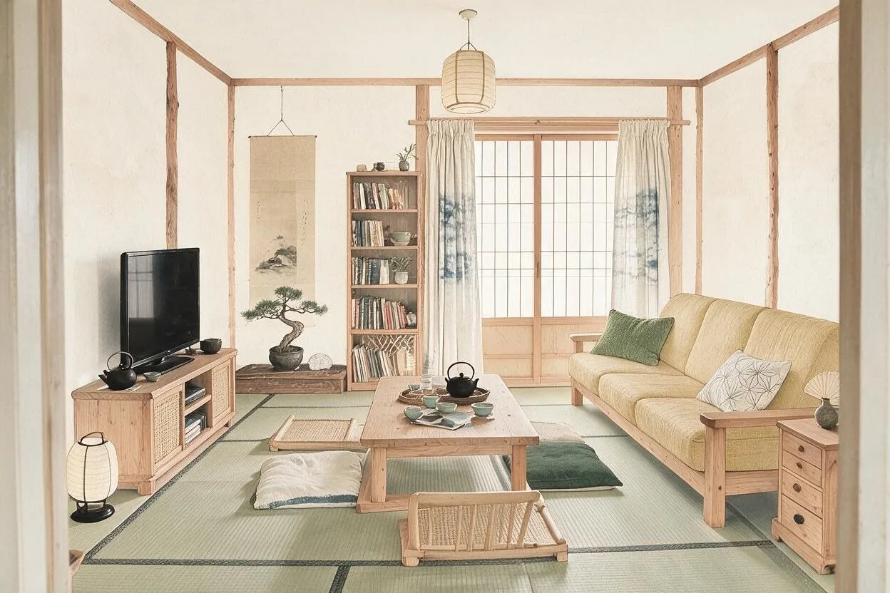
The traditional one: rice paper, straw and black, as calm as a tea room.
-
Rice paper
Walls
#F1ECDF -
Straw
Sofa and cushions
#CDB98C -
Hinoki
Wood furniture
#D2B48A -
Ink black
Frames and lamps
#262422 -
Moss
Plants and one cushion
#6F7652
Indigo
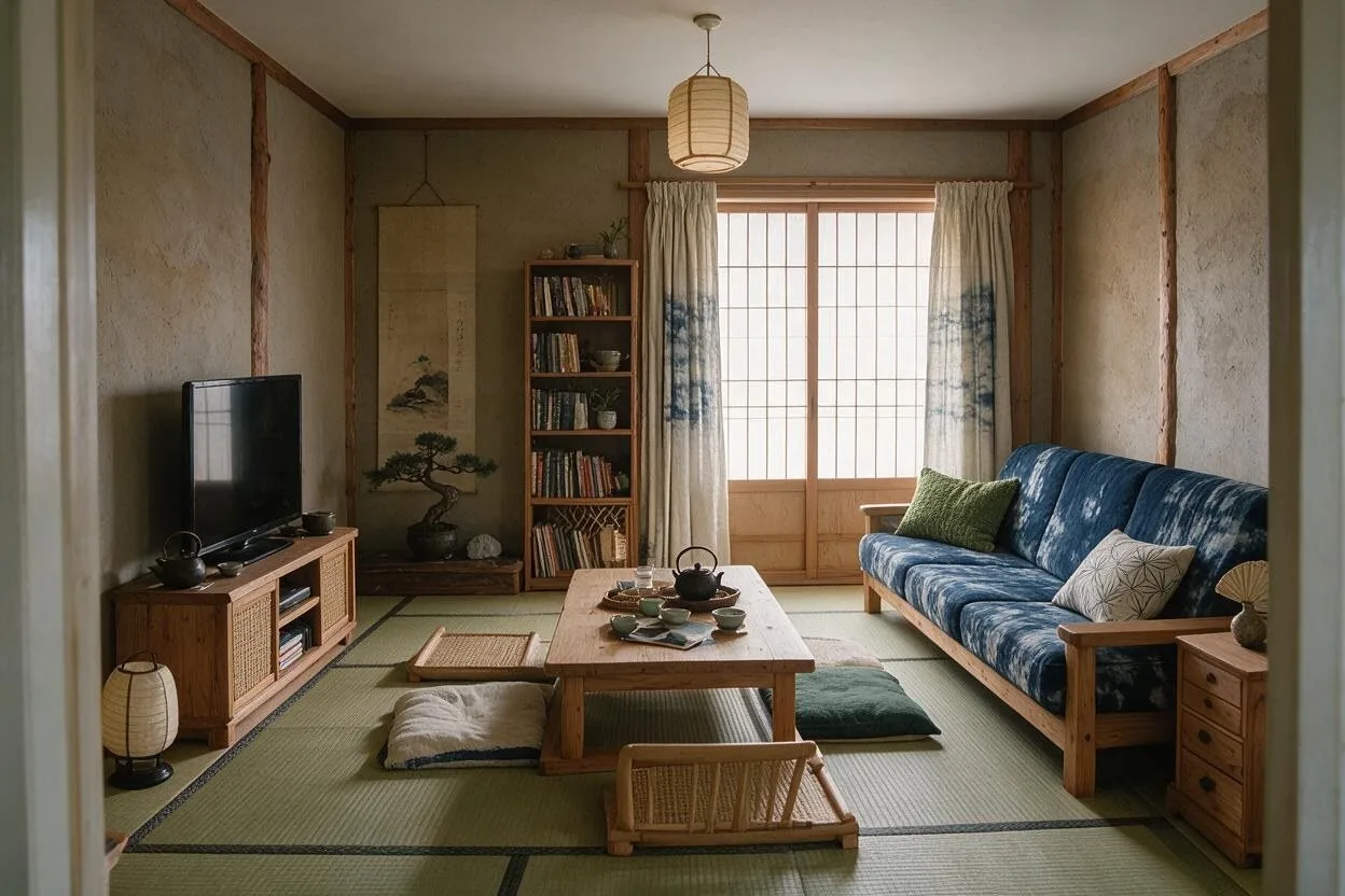
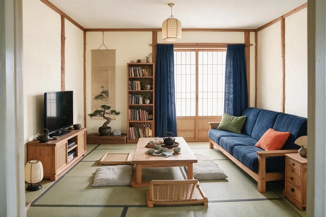
The blue one: indigo textiles on cream, like old workwear and noren curtains.
-
Cream
Walls
#EFE8DA -
Indigo
Sofa and curtains
#2F3F5E -
Cedar
Wood furniture
#9C6B48 -
Pale gray
Rug and cushions
#CFCBC2 -
Persimmon
One accent cushion
#C2643A
Matcha and Charcoal
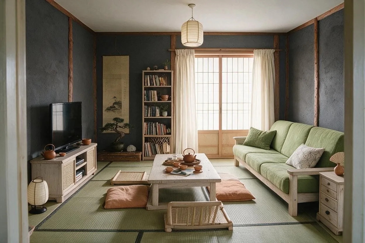
The darker one: charcoal walls with matcha green and pale wood.
-
Charcoal
Walls
#45433F -
Matcha
Sofa
#9EA572 -
Pale ash
Wood furniture
#D3C2A4 -
Paper white
Lampshades and curtains
#F2EEE6 -
Clay
Pottery and rug
#A97B5E
How to use a palette
Every palette here is listed from the most of the room to the least. Keep roughly to that order and the colors hold together.
-
1
Most of the room: the first color
The walls, and often the ceiling. A light, quiet color that everything else sits against.
-
2
A third: the next two
The big pieces: the sofa, the rug, the wood. They set the mood of the room.
-
3
A tenth: the last two
Cushions, a lamp, frames, a vase. Small, so a bold accent stays an accent.
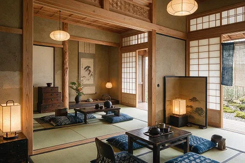
More on Japanese
Empty space, natural materials and quiet order. What makes the style, what to try first, what spoils it, and ordinary rooms before and after.
More palettes
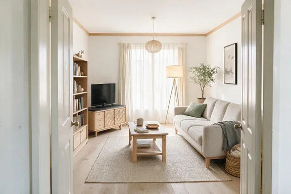
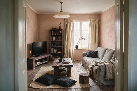
See these colors on your own room.
Upload a photo, pick a palette, and change any color you're not sure about. Free to try, no card needed.