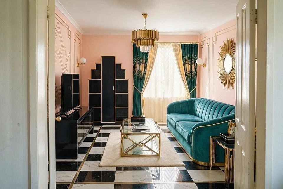
3 palettes, one room
Art Deco color palettes
Art Deco color is about contrast and shine: a deep jewel tone or black, set against cream, with metallic gold or brass catching the light. Use fewer colors than you think, and more gloss.
Every color, and where it goes
Hex codes to match against paint and fabric samples. Colors on screens and in daylight never quite agree, so hold a sample up in the room before you commit.
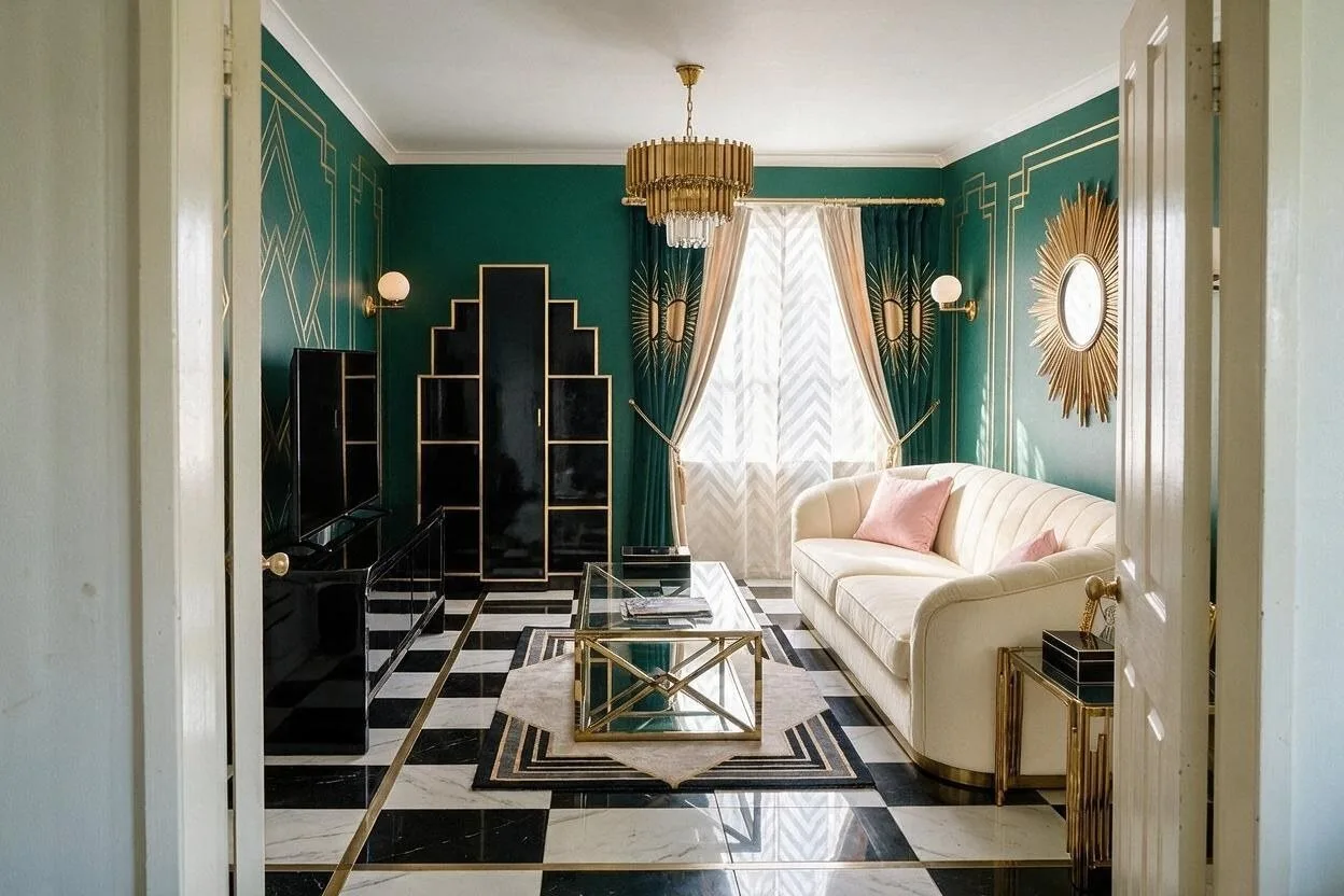
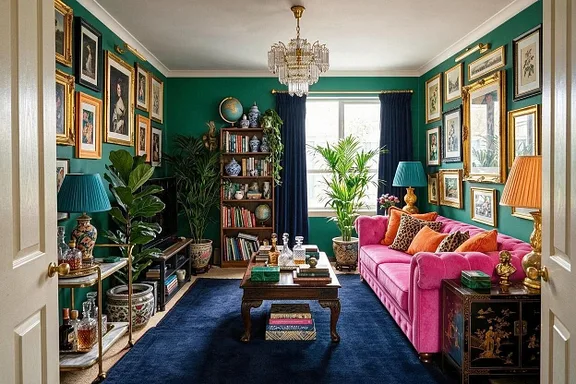
Emerald and Brass
The signature Deco room: deep green walls, brass and black, glamorous after dark.
-
Emerald
Walls
#1E4D3F -
Ivory
Sofa
#F1E9D8 -
Black lacquer
Furniture
#1B1B1B -
Brass
Lamps, mirror and hardware
#B8934A -
Blush
Cushions
#D9A7A0
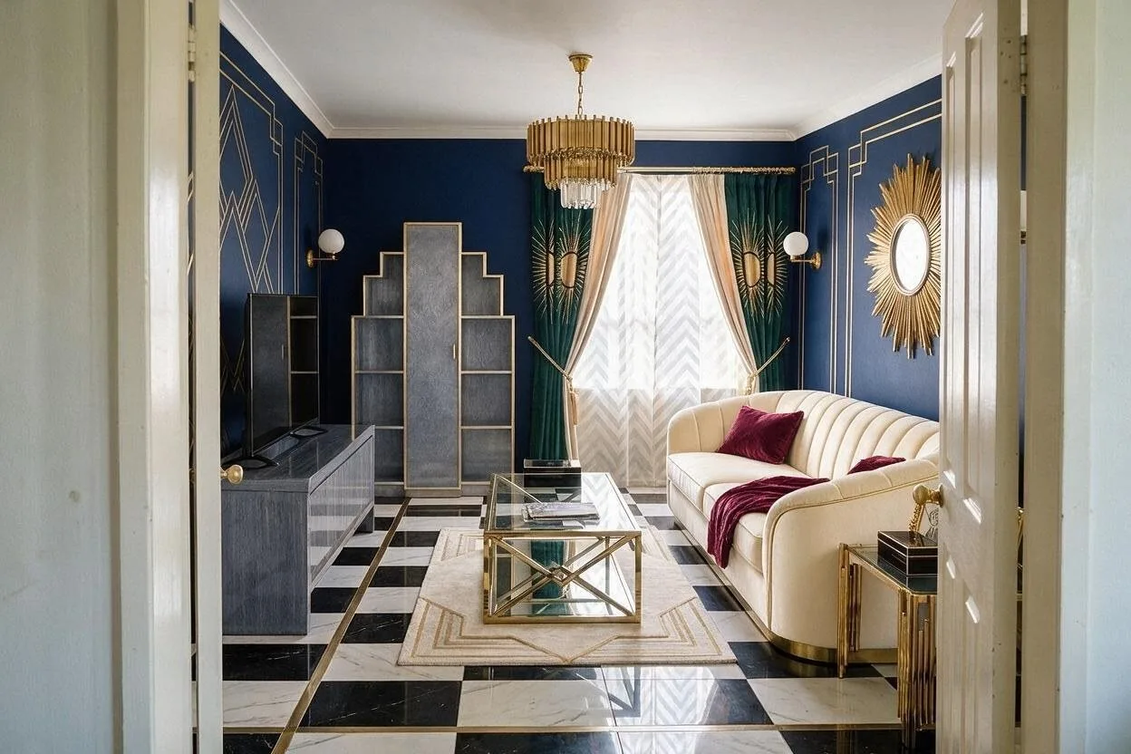
Midnight and Gold
The dramatic one: midnight blue and gold, with burgundy velvet for warmth.
-
Midnight navy
Walls
#1C2541 -
Cream
Sofa and rug
#EFE6D2 -
Smoke gray
Furniture
#7C7F86 -
Gold
Lamps and frames
#C9A24D -
Burgundy
Cushions and throw
#6E2333
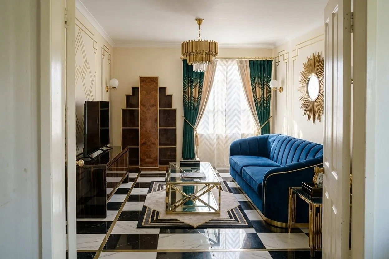
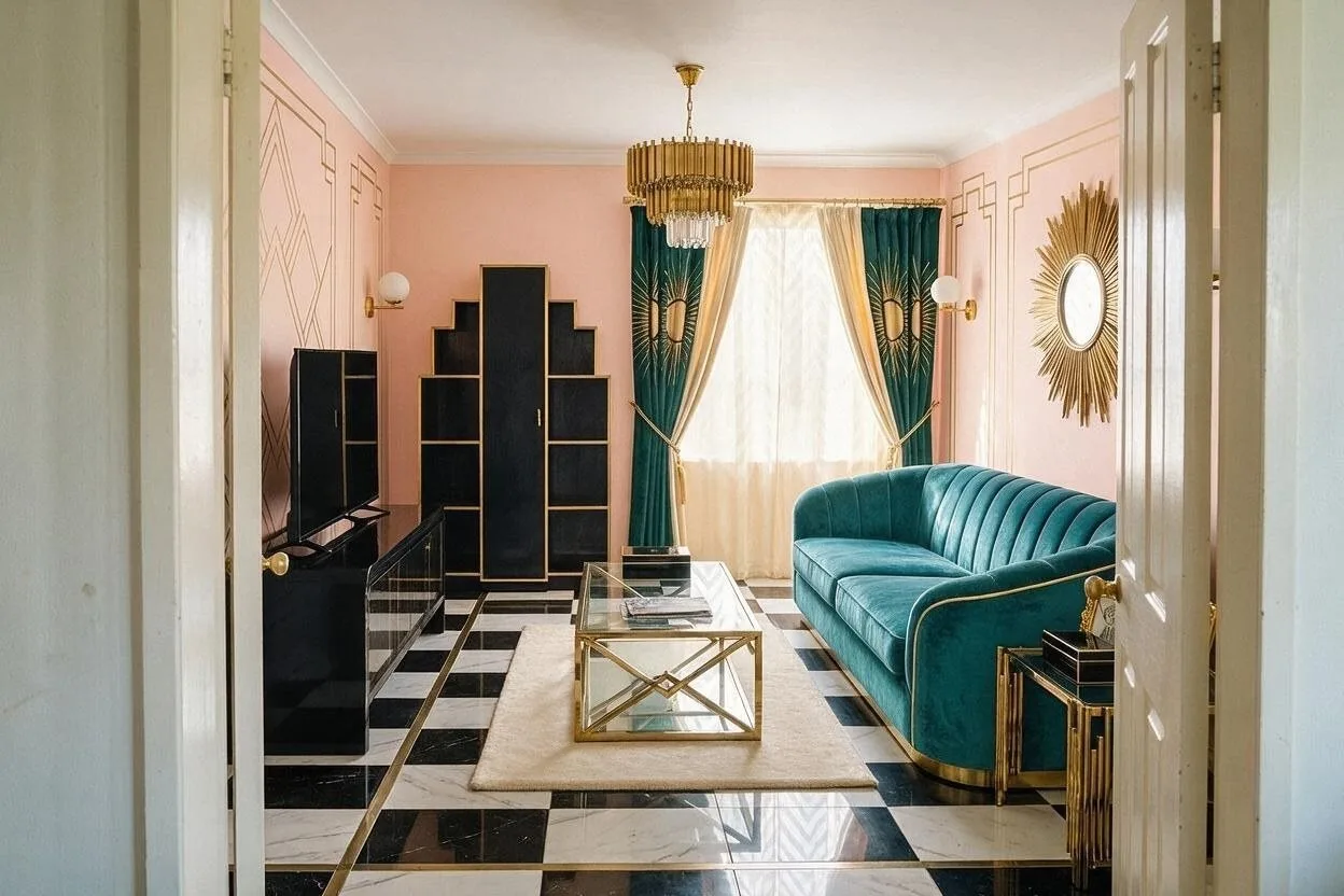
Peach Salon
The light one: peach walls and teal velvet, Deco for a room that is used by day.
-
Peach
Walls
#E9C2A6 -
Teal velvet
Sofa
#1F5C5B -
Ivory
Rug and curtains
#F1E9D8 -
Black
Furniture and frames
#1E1E1E -
Brass
Lamps and mirror
#B8934A
How to use a palette
Every palette here is listed from the most of the room to the least. Keep roughly to that order and the colors hold together.
-
1
Most of the room: the first color
The walls, and often the ceiling. A light, quiet color that everything else sits against.
-
2
A third: the next two
The big pieces: the sofa, the rug, the wood. They set the mood of the room.
-
3
A tenth: the last two
Cushions, a lamp, frames, a vase. Small, so a bold accent stays an accent.
More on Art Deco
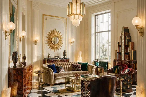
Geometry, gloss and glamour from the 1920s. What makes the style, what to try first, what spoils it, and ordinary rooms before and after.
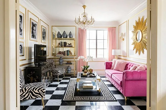
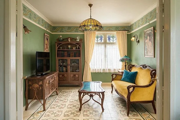
More palettes
See these colors on your own room.
Upload a photo, pick a palette, and change any color you're not sure about. Free to try, no card needed.