What is Advancing Colors?
Advancing colors are Hues that appear to come forward in a space, making walls seem closer.
Description
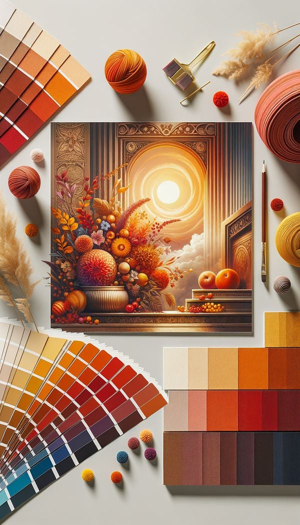
Advancing colors refer to Warm Colors and vivid hues in the Color Spectrum that have the visual effect of making surfaces appear closer than they are. This phenomenon is a crucial aspect of Color Psychology and color theory in interior design, affecting the perceived size and ambiance of a room. Advancing colors typically include shades of red, orange, and yellow. These colors are known for their energizing and invigorating qualities, and their ability to advance towards the viewer decreases the perceived distance between the viewer and the surface painted in these hues.
When used effectively, advancing colors can create a more intimate and cozy atmosphere in large rooms, as they visually reduce the space. However, in smaller spaces, excessive use of advancing colors may make the room feel cramped and overwhelming. It's important for interior designers to balance these colors with receding colors, which have the opposite effect of making spaces appear larger and more open.
Usage
In a spacious living room with high ceilings and vast wall spaces, an interior designer might choose to paint one accent wall in a warm shade of orange. This use of an advancing color creates a focal point and makes the expansive room feel more inviting and cozy. In another scenario, a designer might use a vibrant red as an Accent Color in a dining area to stimulate conversation and appetite, drawing the diners closer both physically and metaphorically.
FAQs
-
Why are certain colors considered advancing colors?
Certain colors are considered advancing because of their psychological effects and how the eye perceives them. Warm hues like red, orange, and yellow tend to stimulate the viewer's senses and create the illusion of surfaces moving towards us, thus making them appear closer.
-
How do advancing colors affect the ambiance of a room?
Advancing colors can dramatically affect the ambiance of a room by creating an intimate, energizing, or stimulating environment. They make large spaces feel cozier and more welcoming but can make small rooms feel cramped if used excessively.
-
What is the difference between advancing colors and receding colors?
The main difference between advancing colors and receding colors lies in their visual effects on space perception. Advancing colors make surfaces appear closer, creating a sense of intimacy, while receding colors, typically cool hues like blue and green, make spaces seem more open and expansive.
Practical Application
To skillfully incorporate advancing colors into your interior design projects, consider the size and function of the room. Use advancing colors as accent walls or in decorative accessories to add warmth and vibrance to large, impersonal spaces. In contrast, use them sparingly in smaller rooms, balancing them with Neutral Colors or receding hues to prevent the space from feeling overwhelming. It's also beneficial to layer different Textures and shades within the advancing color palette to add depth and interest.
Try this in Room AI
Turn what you've learned into a real room design.
-
Accent ColorAn accent color is a color used sparingly to add vibrancy and interest to a room.
-
AccessoriesAccessories in interior design refer to items used to enhance the aesthetic appeal and functionality of a space.
-
BalanceBalance in interior design refers to the distribution of Visual Weight in a space.
-
Built-inBuilt-in refers to any feature or piece of furniture that is permanently integrated into a room's structure as a Fixture.
-
CarpetCarpet is a Floor Covering made from thick woven fabric.