What goes with it, and 3 palettes
Olive green color palettes
Olive is a warm, yellowish green that feels natural and a little vintage. It works best with other earthy colors, cream, rust, camel and wood, and looks richest in a velvet sofa or on painted cabinets.
#6E7148
What colors go with olive green
Cream
#F1EBE0
Cream lets olive look warm and fresh rather than muddy.
Rust
#A9502F
Rust and olive are a warm, autumnal pairing.
Blush
#E3C3B6
A soft pink lifts olive and makes it feel modern.
Camel
#B58C5C
Camel leather or wool with olive feels relaxed and natural.
Burgundy
#6D2433
A deep wine red with olive is rich and balanced.
Brass
#B8934A
Warm metal brings out olive's yellow undertone.
Olive green palettes, on real rooms
Hex codes to match against paint and fabric samples. Colors on screens and in daylight never quite agree, so hold a sample up in the room before you commit.
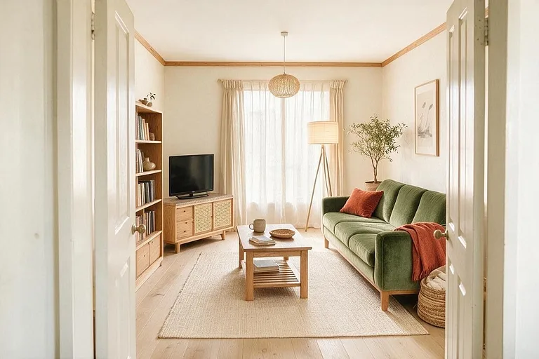
Olive Velvet
An olive sofa with cream and rust, natural and warm. Pictured: a Japandi living room.
-
Cream
Walls
#F1EBE0 -
Olive green
Sofa
#6E7148 -
Rust
Cushions and throw
#A9502F -
Light oak
Wood furniture
#CDAF86 -
Oatmeal
Rug and curtains
#DCCFBA
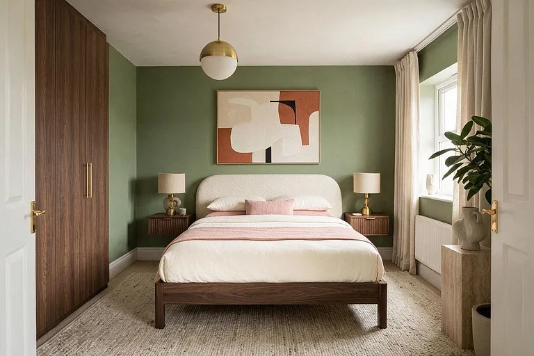
Olive and Blush
Olive walls with blush and cream bedding, earthy but soft. Pictured: a Modern bedroom.
-
Olive green
Walls
#6E7148 -
Cream
Bedding
#F1EBE0 -
Blush
Cushions and throw
#E3C3B6 -
Walnut
Bed frame and wardrobe
#5C4232 -
Brass
Lamps and pendant
#B8934A
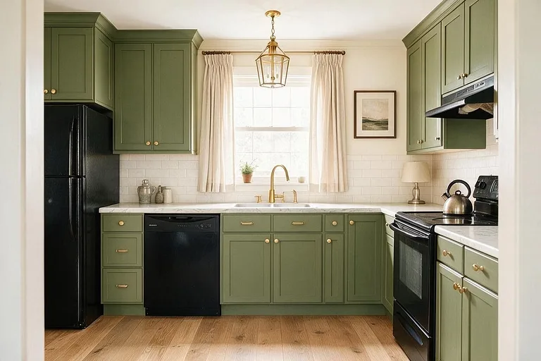
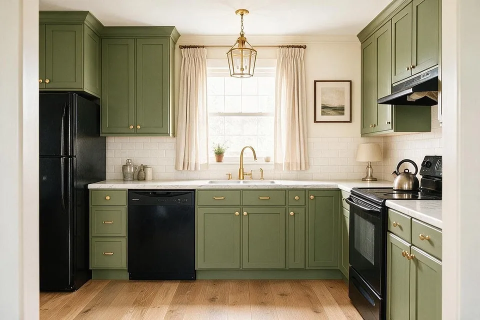
Olive Kitchen
Olive cabinets with cream and brass, a warm, vintage kitchen. Pictured: a Transitional kitchen.
-
Cream
Walls
#EFE8DA -
Olive green
Cabinets
#6E7148 -
Marble white
Countertop and backsplash
#E9E6E0 -
Oak
Floor
#B08A5F -
Brass
Hardware, faucet and pendant
#B8934A
How to use a palette
Every palette here is listed from the most of the room to the least. Keep roughly to that order and the colors hold together.
-
1
Most of the room: the first color
The walls, and often the ceiling. A light, quiet color that everything else sits against.
-
2
A third: the next two
The big pieces: the sofa, the rug, the wood. They set the mood of the room.
-
3
A tenth: the last two
Cushions, a lamp, frames, a vase. Small, so a bold accent stays an accent.
More palettes
See these colors on your own room.
Upload a photo, pick a palette, and change any color you're not sure about. Free to try, no card needed.