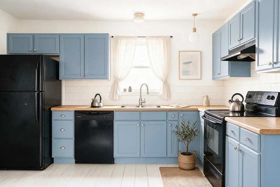
6 color schemes, each on a real kitchen
Kitchen color palettes
In a kitchen the cabinets are the color decision: they cover more wall than paint ever will and cost the most to change. Pick the cabinet color first, let the countertop and backsplash quiet it down, and use hardware to add the warmth or the shine.
6 kitchen color schemes
Hex codes to match against paint and fabric samples. Colors on screens and in daylight never quite agree, so hold a sample up in the room before you commit.
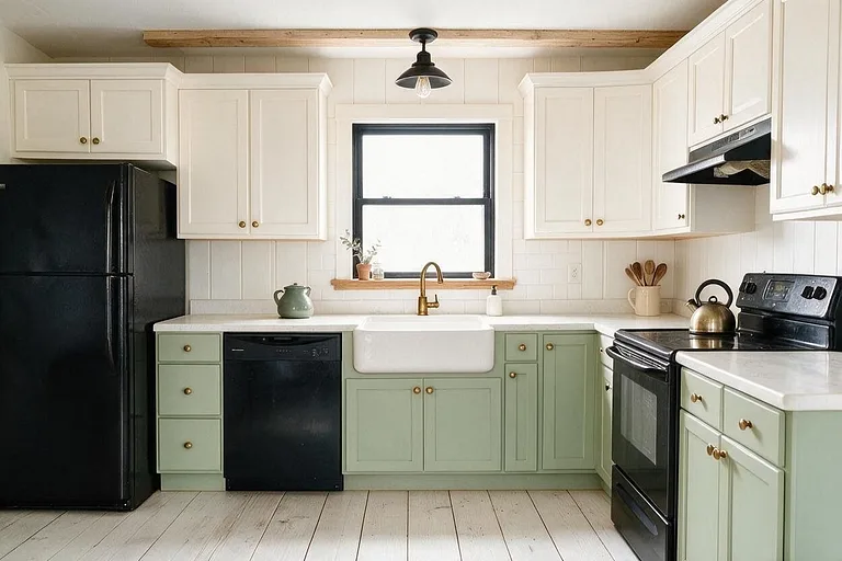
Sage Shaker
Soft green cabinets with white and brass, the friendliest kitchen color of the last few years. Pictured: a Farmhouse kitchen.
-
Warm white
Walls and upper cabinets
#F3EFE6 -
Sage green
Lower cabinets
#9AA88A -
White quartz
Countertop and backsplash
#ECE9E2 -
Natural oak
Open shelf and stools
#B8935F -
Aged brass
Hardware and faucet
#A88A54
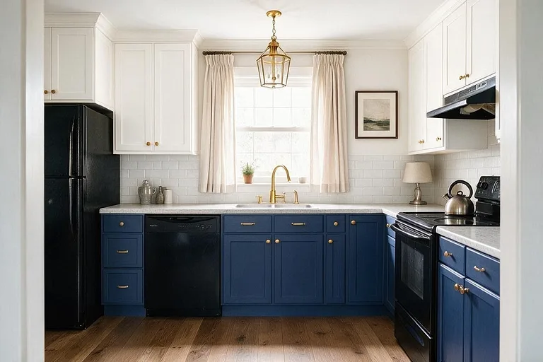
Navy and Brass
Deep navy lowers under white uppers, classic and hard to tire of. Pictured: a Transitional kitchen.
-
Soft white
Walls and upper cabinets
#F2F0EA -
Navy
Lower cabinets
#25344D -
Marble white
Countertop
#E9E6E0 -
Pale gray
Backsplash
#D3D3CE -
Brass
Hardware, faucet and pendant
#B8934A
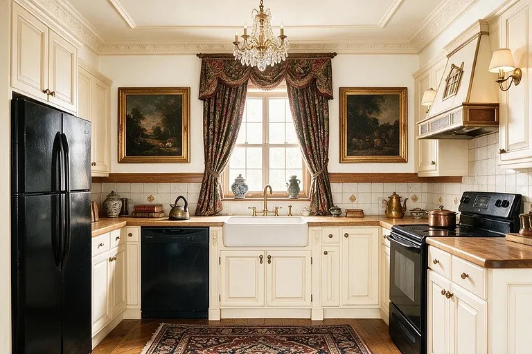
Cream and Oak
Cream painted cabinets and honey oak, a dark kitchen made light without losing its warmth. Pictured: a Traditional kitchen.
-
Cream
Cabinets
#EFE7D6 -
Warm white
Walls
#F5F1E8 -
Honey oak
Countertop and floor
#B98A50 -
Stone beige
Backsplash
#D8CBB4 -
Antique bronze
Hardware
#6B5440
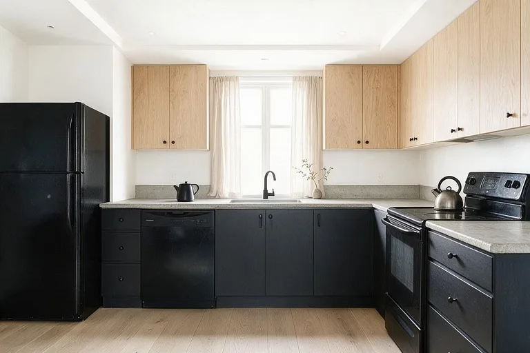
Charcoal and Oak
Charcoal lowers and pale oak uppers, modern and forgiving of fingerprints. Pictured: a Minimalist kitchen.
-
White
Walls
#F4F4F1 -
Charcoal
Lower cabinets
#3A3B3C -
Pale oak
Upper cabinets
#CFB58C -
Concrete gray
Countertop and backsplash
#B4B2AC -
Matte black
Hardware and faucet
#1F1F1F
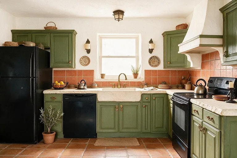
Olive and Terracotta
Olive cabinets with clay-colored tile, a sunny kitchen with a southern feel. Pictured: a Mediterranean kitchen.
-
Lime white
Walls
#EFE8DA -
Olive green
Cabinets
#6E7048 -
Terracotta
Backsplash tile
#B8653F -
Cream stone
Countertop
#E3D8C3 -
Aged brass
Hardware and faucet
#A88A54
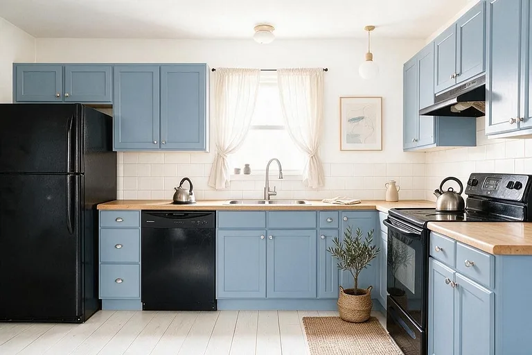
Dusty Blue
Pale blue-gray cabinets with oak and white, calm and bright in a north-facing kitchen. Pictured: a Scandinavian kitchen.
-
White
Walls
#F5F4F0 -
Dusty blue
Cabinets
#8FA3B3 -
Light oak
Countertop and shelves
#CDAE82 -
Off-white
Backsplash
#EDEAE3 -
Brushed nickel
Hardware and faucet
#A7A8A6
How to use a palette
Every palette here is listed from the most of the room to the least. Keep roughly to that order and the colors hold together.
-
1
Most of the room: the first color
The walls, and often the ceiling. A light, quiet color that everything else sits against.
-
2
A third: the next two
The big pieces: the sofa, the rug, the wood. They set the mood of the room.
-
3
A tenth: the last two
Cushions, a lamp, frames, a vase. Small, so a bold accent stays an accent.
More palettes
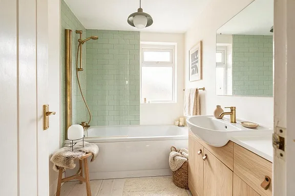
See these colors on your own room.
Upload a photo, pick a palette, and change any color you're not sure about. Free to try, no card needed.