What is Primary Colors?
Primary colors are the foundation of color theory, comprising red, blue, and yellow.
Description
In the realm of interior design, understanding primary colors is essential as they form the basis of color theory, a fundamental concept that guides designers in creating visually appealing spaces. These colors include red, blue, and yellow. They are called 'primary' because they cannot be created by mixing other colors together; instead, they serve as the source of all other colors on the color wheel. By combining primary colors at different proportions, you can generate a wide array of secondary and tertiary colors, thereby expanding the palette for design projects.
The psychological effects of primary colors on inhabitants are pivotal in interior design planning. For example, red is often associated with energy and passion, blue with calmness and serenity, and yellow with happiness and optimism. These associations make primary colors powerful tools in creating environments that evoke specific emotions and behaviors. Moreover, understanding how these colors interact with each other and with varying light conditions allows designers to craft spaces that are both beautiful and functional.
Usage
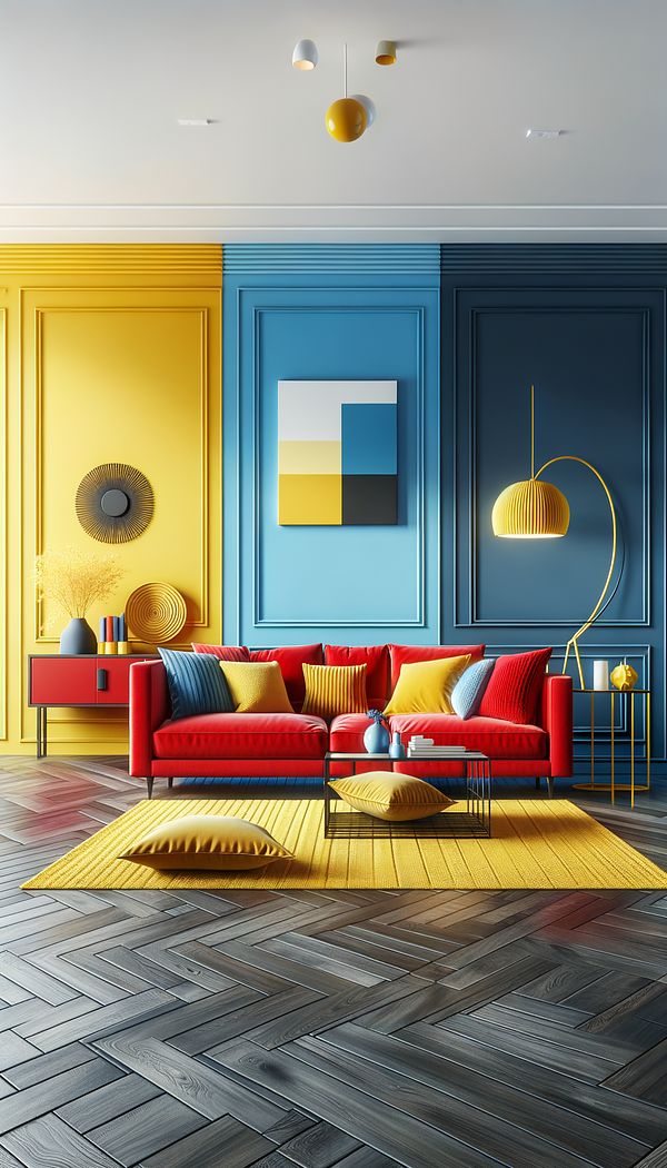
A living room space could exemplify the use of primary colors by having a bold red sofa as a statement piece, paired with blue accent walls and yellow decorative elements like pillows and rugs. This combination not only creates a vibrant and energetic atmosphere but also demonstrates the harmony achievable through the thoughtful application of primary colors. Also, in modern and minimalist designs, using a monochromatic palette derived from a single primary color can create a cohesive and impactful aesthetic.
FAQs
-
Why are primary colors important in interior design?
Primary colors are paramount in interior design because they form the foundation of color theory, aiding designers in creating visually and emotionally balanced spaces. Their understanding is crucial for generating a broad spectrum of colors and invoking desired emotional responses.
-
Can primary colors be mixed to create new colors?
Yes, primary colors can be mixed in various proportions to create secondary colors (such as green, orange, and purple) and further mixed to generate an even wider range of tertiary and quaternary colors, offering a vast palette for design projects.
-
How do primary colors affect mood and atmosphere in a room?
Primary colors have specific psychological impacts: red can evoke energy and passion, blue can induce calmness and serenity, and yellow can inspire happiness and optimism. These effects allow designers to shape the atmosphere and emotional tone of a space.
Practical Application
When integrating primary colors into your design, start by selecting one primary color as a focal point and use it boldly in a key piece or area. Then, introduce the other two primary colors through accents and accessories to create depth and interest. Consider the emotional impact of each color and the lighting conditions of the space to optimize the visual and emotional balance. Layering and textural variations of the primary colors can also add complexity and richness to the design.
-
Design Styles478 articles
-
Decorating Principles & Elements330 articles
-
Color & Patterns154 articles
-
Finger PlatesFinger plates are protective plates mounted on doors to prevent wear and tear from frequent handling.
-
VoileVoile is a lightweight, sheer fabric, often used in soft furnishing and garments.
-
HueHue refers to the pure color without tint or shade, determining its place on the color wheel.
-
ChecksChecks refer to a pattern comprising of crisscrossed horizontal and vertical lines, forming squares.
-
AsymmetricalAsymmetrical refers to a design that is not symmetrical, exhibiting balance through differing elements.
