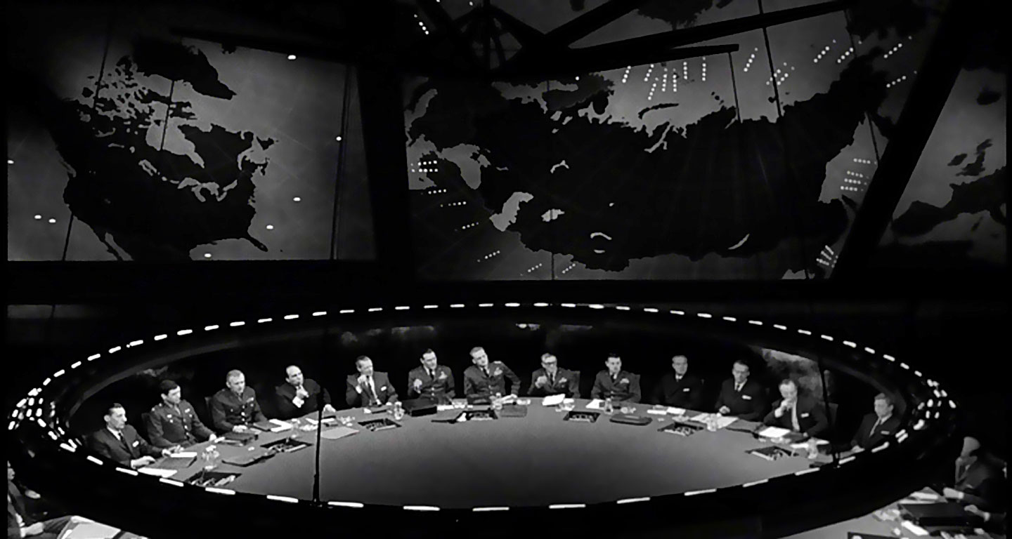
Our AI interior designer reviewed your room…
Our first impression
Let's dive into the details
Colors
Current Palette
Mostly black, shades of grey, and white
Harmony Assessment
The colors complement each other well, reinforcing the serious tone of the space.
Furniture
Functionality
The central table serves as the focal point for discussion, which seems appropriate for its function.
Arrangement
The concentric seating arrangement maximizes face-to-face interaction.
Lighting
Natural Light
There is no visible natural light, emphasizing the enclosed, secluded nature of the room.
Artificial Light
Overhead, built-in lighting appears professional and consistent with the intended use of the space.
Textiles & Decor
Current Textiles
There are no visible textiles within the space, which aligns with the utilitarian setting.
Decor Style
The minimalist decor is consistent with the space's function and mood.
Walls & Floors
Condition
The walls and floor are depicted in a high-contrast, monochromatic style suited for the scene.
Color and Material
Dark materials, possibly indicative of metal or stone, suggest durability and gravitas.
Accessories
Present Pieces
There is a significant world map on the wall, emphasizing the global scale of the discussions likely taking place at the table.
Suitability
This piece is extremely suitable for setting the scene and context.
Flow & Layout
Ease of Movement
The circular layout provides clear paths for movement.
Space Utilization
The room is designed for a single purpose, and it fulfills that effectively.
Potential
Standout Elements
The striking world map and unusual circular table make the space memorable.
Underutilized Spaces
In this scenario, none; the purposeful design leaves little room for additional uses.
Summary
Top Priorities
Consider introducing ergonomic chairs, layered lighting, and maybe some color or texture to soften the ambiance.
Budget Considerations
Changes should align with the budget and not compromise the space's original purpose.